- Select a language for the TTS:
- UK English Female
- UK English Male
- US English Female
- US English Male
- Australian Female
- Australian Male
- Language selected: (auto detect) - EN
Play all audios:
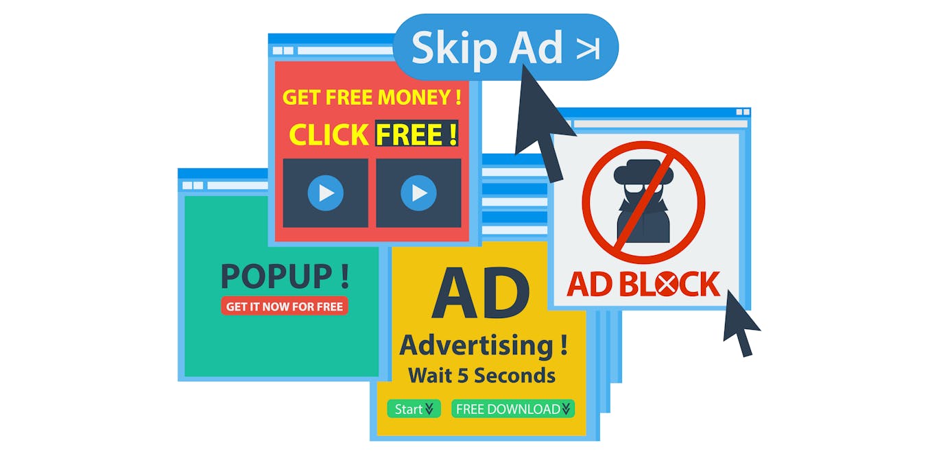
The vast majority of websites you visit now greet you with a pop-up. This annoying impediment to your seamless web browsing is called the “cookie banner”, and it’s there to secure your
consent, as per online privacy laws, for websites to retain information about you between browsing sessions. The cookie banner purports to offer you a choice: consent to only the essential
cookies that help maintain your browsing functionality, or accept them all – including cookies that track your browsing history to sell on to targeted advertising firms. Because those
additional cookies generate extra revenue for the websites we visit, cookie banners are often designed to trick you into clicking “accept all”. The UK’s information commissioner recently
urged G7 countries to address this problem, highlighting how fatigued web users are agreeing to share more personal data than they’d like. But in truth, manipulative cookie banners are just
one example of what’s called “dark design” – the practice of creating user interfaces that are intentionally designed to trick or deceive the user. Dark design has proven to be an incredibly
effective way of encouraging web users to part with their time, money and privacy. This in turn has established “dark patterns”, or sets of practices designers know they can use to
manipulate web users. They’re difficult to spot, but they’re increasingly prevalent in the websites and apps we use every day, creating products that are manipulative by design, much like
the persistent, ever-present pop-ups we’re forced to close when we visit a new website. Cookie banners remain the most obvious form of dark design. You’ll notice how the “accept all” button
is large and cheerfully highlighted, attracting your cursor within a split second of your arrival on a website. Meanwhile, the dowdy, less prominent “confirm choices” or “manage settings”
buttons – the ones through which we can protect our privacy – scare us away with more time-consuming clicks. You’ll know from experience which one you tend to click. Or you can try the
Cookie Consent Speed-Run, an online game that exposes how difficult it is to click the right button in the face of dark design. E-commerce websites also frequently use dark patterns. Say
you’ve found a competitively priced product you’d like to buy. You dutifully create an account, select your product specifications, input delivery details, click through to the payment page
– and discover the final cost, including delivery, is mysteriously higher than you’d originally thought. These “hidden costs” aren’t accidental: the designer is hoping you’ll just hit
“order” rather than spending even more time repeating the same process on another website. Other elements of dark design are less obvious. Free services such as Facebook and YouTube monetise
your attention by placing advertisements in front of you as you scroll, browse or watch. In this “attention economy”, the more you scroll or watch, the more money the companies make. So
these platforms are intentionally optimised to command and retain your attention, even if you’d rather close the app and get on with your day. For example, the expertly crafted algorithm
behind YouTube’s “Up Next” video suggestions can keep us watching for hours if we let them. ------------------------- _ READ MORE: REMEMBER, YOU'RE BEING MANIPULATED ON SOCIAL MEDIA: 4
ESSENTIAL READS _ ------------------------- APP DESIGN Manipulating users for commercial gain isn’t just used on websites. Currently, more than 95% of Android apps on the Google Play store
are free to download and use. Creating these apps is an expensive business, requiring teams of designers, developers, artists, and testers. But designers know that they’ll recoup this
investment once we’re hooked on their “free” apps – and they do it using dark design. In recent research analysing free app-based games that are popular with today’s teenagers, my colleague
and I identified dozens of examples of dark design. Users are forced to watch adverts and frequently encounter disguised adverts that look like part of the game. They’re prompted to share
posts on social media and, as their friends join the game, are prompted to make in-app purchases to differentiate their character from those of their peers. Some of this psychological
manipulation seems inappropriate for younger users. Teenage girls’ susceptibility to peer influence is exploited to encourage them to buy clothes for in-game avatars. Some games promote
unhealthy body imagery while others actively demonstrate and encourage bullying through indirect aggression between characters. There are mechanisms to protect young users from psychological
manipulation, such as age rating systems, codes of practice, and guidance that specifically prohibits the use of dark design. But these rely on developers understanding and interpreting
this guidance correctly and, in the case of the Google Play store, developers vet their own work and it’s up to users to report any issues. My research indicates that these measures are not
yet proving entirely effective. SHEDDING LIGHT The problem with dark design is that it’s difficult to spot. And dark patterns, which are established in every developer’s toolbox, spread
fast. They’re hard for designers to resist when free apps and websites are competing for our attention, judged on metrics like “time on page” and the “user conversion rate”. So while cookie
banners are annoying and often dishonest, we need to consider the broader implications of an online ecosystem that is increasingly manipulative by design. Dark design is used to influence
our decisions about our time, our money, our personal data and our consent. But a critical understanding of how dark patterns work, and what they’re hoping to achieve, can help us detect and
overcome their trickery. _Google had not replied to a request for comment on this story by the time it was published_