- Select a language for the TTS:
- UK English Female
- UK English Male
- US English Female
- US English Male
- Australian Female
- Australian Male
- Language selected: (auto detect) - EN
Play all audios:
CONTEXT | RESEARCHED USER GROUP | PRODUCT To provide an example of how a Seattle user group could use City of Seattle public data to inform their actions, I visualized City of Seattle 911
Incident Response data for the prospective, general homebuyer. I assumed that the user group, a Seattle prospective homebuyer, is interested in home-ownership as an investment just as much
as it is a shelter purchase, especially considering the rising housing costs and projected housing costs in the future. According to some brief research, increased home value is correlated
with high neighborhood security and low noise disturbances. Therefore, I focused my visualizations towards police reports of noise complaints, residential theft, and auto-related thefts
organized by location and neighborhood zones. The resulting visuals took form as interactive, cross-referential maps of thefts/burglaries and an interactive bar graph that shows the counts
of noise disturbances (Image 1). PROCESS & PROBLEMS Because of the wide geographical repercussions of crimes on a neighborhood’s value and the influence of adjacent home values upon a
home for sale, mapping the police reports was the main method of representing the data (Image 2). In addition to visualizing theft crimes, I represented data on general and residential noise
complaints during the main hours of homestay (5pm — 8am) (Image 1). I found it more difficult to represent the noise information because the amount of precise filtering to portray this data
legibly in a map exceeded my knowledge of the visualization software, Tableau. Upon resorting to a non-geographical representation, summary locational data still needed to be expressed;
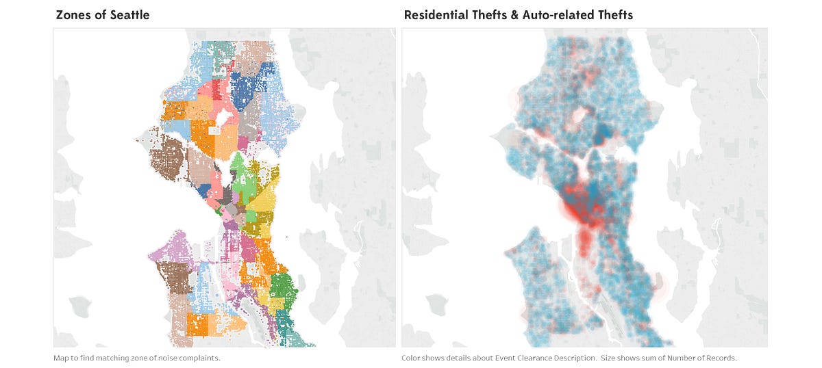
this took the form of using City of Seattle defined zones — seemingly, arbitrarily coded neighborhoods. In turn, a significant legend was necessary to connect the dots between zone noise
complaints and comprehensible locations (right map of Image 2). Making these choices allows the visualizations to be most universal and allows the analysis to be done by the user group;
however, this raised the question: > In order to create more informative visualizations, should I have > begun an analysis upon my creations to inform a more focused, but > less
flexible visualization package? VISUALIZING IN THE FUTURE Beginning to address my raised question and considering that this visualization package was to inform the City of _how_ a user group
could use the data, I should’ve taken assumed the role of a prospective homebuyer — I should have made a less flexible visualization package in order to present more relevant information.
In hindsight, I should have used the findings of visualizations to hone the content for the other visualizations; in other words, enable each visualization to inform the others, rather than
just act as glorified legends. For example, upon creating the “Residential Thefts & Auto-related Thefts”, I could have analyzed the map, found the “safest” neighborhoods, and then
created a line graph that compared the “safest” neighborhoods noise levels throughout the day. In the future, I will produce more research upon the user group/ audience in order to assume
their role more accurately when creating data visualizations in hopes of imparting more relevancy in the final product.


.jpg?w=1200&ar=40%3A21&auto=format%2Ccompress&ogImage=true&mode=crop&enlarge=true&overlay=false&overlay_position=bottom&overlay_width=100)


:max_bytes(150000):strip_icc():focal(665x0:667x2)/kim-kardashian-1-2000-1-aa52dcfd06a54f87b06aee39ab4b3276.jpg)
