- Select a language for the TTS:
- UK English Female
- UK English Male
- US English Female
- US English Male
- Australian Female
- Australian Male
- Language selected: (auto detect) - EN
Play all audios:
Loading...
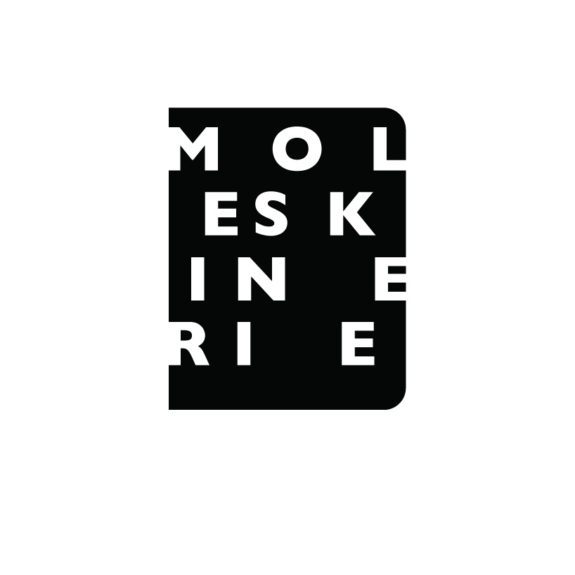
DESIGNER'S OWN WORDS: The Moleskinerie logo I designed has a beautiful and strong contrast with the Moleskine logo. Still the Moleskinerie logo refers clearly to the Moleskine brand.
The logo reads Moleskinerie like you would read a book or a blog text. The interspacing of the Moleskinerie letters give a random feel of freedom, but are composed with care. An interesting
composition in letters and space. The Moleskinerie tekst is placed om an abstract shape of a Moleskine book. This gives a very recognisable and strong image. The logo is executed in single
colour and can be used in every possible colour. menno oosterhuis nov 10, 2011 previous next shortlisted entries (2162)